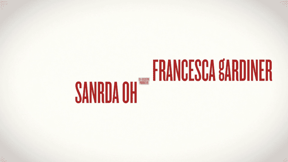
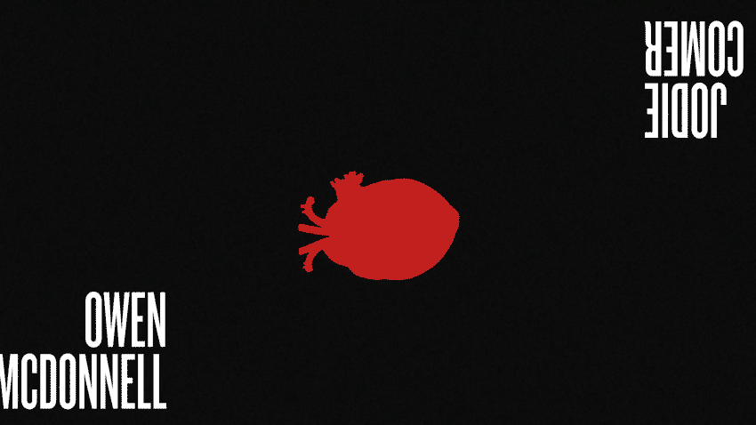
Edward Wang. A graphic designer. I am a visual storyteller with clear, confident, and concise design solutions. Let's talk.
My Work About Me Contact

Killing Eve Opening

Motion Design


Project Objective
Design a title sequence for a book, movie, or television show, that exists or that you create. It must be stylized thoughtfully with an awareness of genre, and must incorporate After Effects skills developed in Christopher Bruffee's Motion Concepts class at Parsons.

Concept
Killing Eve is a British drama of an MI6 spy who grows increasingly obsessed with tracking down a talented female assassin—an assassin who is just as obsessed with leaving clues for her with every kill. With its strong diverse lead cast, unconventionally witty tone, and uniquely designed typeface, Killing Eve was the obvious choice to expand into a full opening credit sequence.

Design
With the show's existing title card as a reference point, the design for this opening sequence would be a series of three scenes, focused on type and iconography. The text tilts and shifts subtly through a three dimensional space, evoking a slow calculated pace, allowing for suspense to build and for fast moving objects to surprise.

To view this video please enable JavaScript, and consider upgrading to a web browser that supports HTML5 video

  • My Work
  • About Me
  • Contact

Killing Eve Opening

Motion Design

Project Objective
Design a title sequence for a book, movie, or television show, that exists or that you create. It must be stylized thoughtfully with an awareness of genre, and must incorporate After Effects skills developed in Christopher Bruffee's Motion Concepts class at Parsons.

Concept
Killing Eve is a British drama of an MI6 spy who grows increasingly obsessed with tracking down a talented female assassin—an assassin who is just as obsessed with leaving clues for her with every kill. With its strong diverse lead cast, unconventionally witty tone, and uniquely designed typeface, Killing Eve was the obvious choice to expand into a full opening credit sequence.

Design
With the show's existing title card as a reference point, the design for this opening sequence would be a series of three scenes, focused on type and iconography. The text tilts and shifts subtly through a three dimensional space, evoking a slow calculated pace, allowing for suspense to build and for fast moving objects to surprise.

To view this video please enable JavaScript, and consider upgrading to a web browser that supports HTML5 video