COVER Magazine
Project Objective
Design an arts and design magazine for an arts saavy audience. A collaborative project with my design peers, Chenru Yang and Claire Sullivan, the magazine
demonstrates artistic direction of headlines, folios, captions, and other editorial stylistic choices.
Concept
Our project meetings led us to a collective interest in designing a magazine
that pushed the boundaries of conventional print magazine, within the confines of the 8 by 10 inch pages. It would be something with a boldness in type
and image treatment, as well as a design that would perhaps be considered polarizing—a concept familiar to the art community.
Design
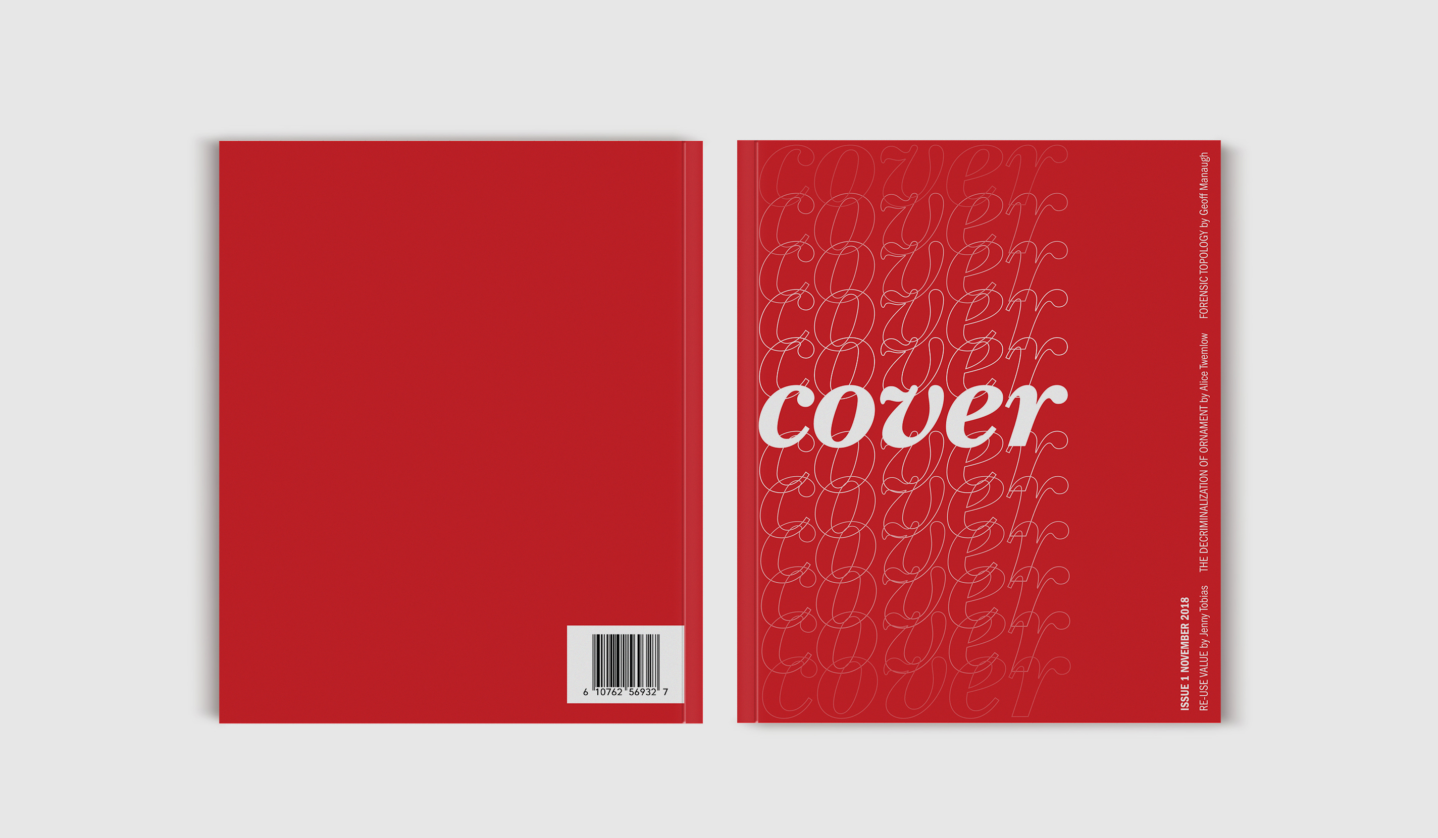
Our concept translated into an artistic decision to go right
up to the outer margins of the pages, evoking a dangerous play on walking the edge; then widening the inner margins to create a breath of white
space. The type followed suit, as a subtle blend of classic and modern typefaces, larger, bold headlines and smaller, compact, yet legible text copy. The imagery was
the element to tie our pages together, with red bleeding through every page, and the imagery not simply illustrations and photographs, but playing with motifs of
multiplication, overlap, and echo. The bottom 3 spreads were independently designed by myself.